About
Starbucks is an American company that operates the largest coffeehouse chain and one of the most recognizable brands in the world.
Starbucks has developed a robust digital ecosystem that integrates advanced technologies to enhance customer experience, streamline operations, and drive business growth. This ecosystem is built on the “Digital Flywheel” framework, which focuses on four pillars: rewards, personalization, payment, and order.


HEURISTIC EVALUATION
STARBUCKS
Starbucks Website
The Starbucks India website provides information about the brand, its coffee heritage, brewing techniques, and product offerings, serving as an educational and promotional platform.
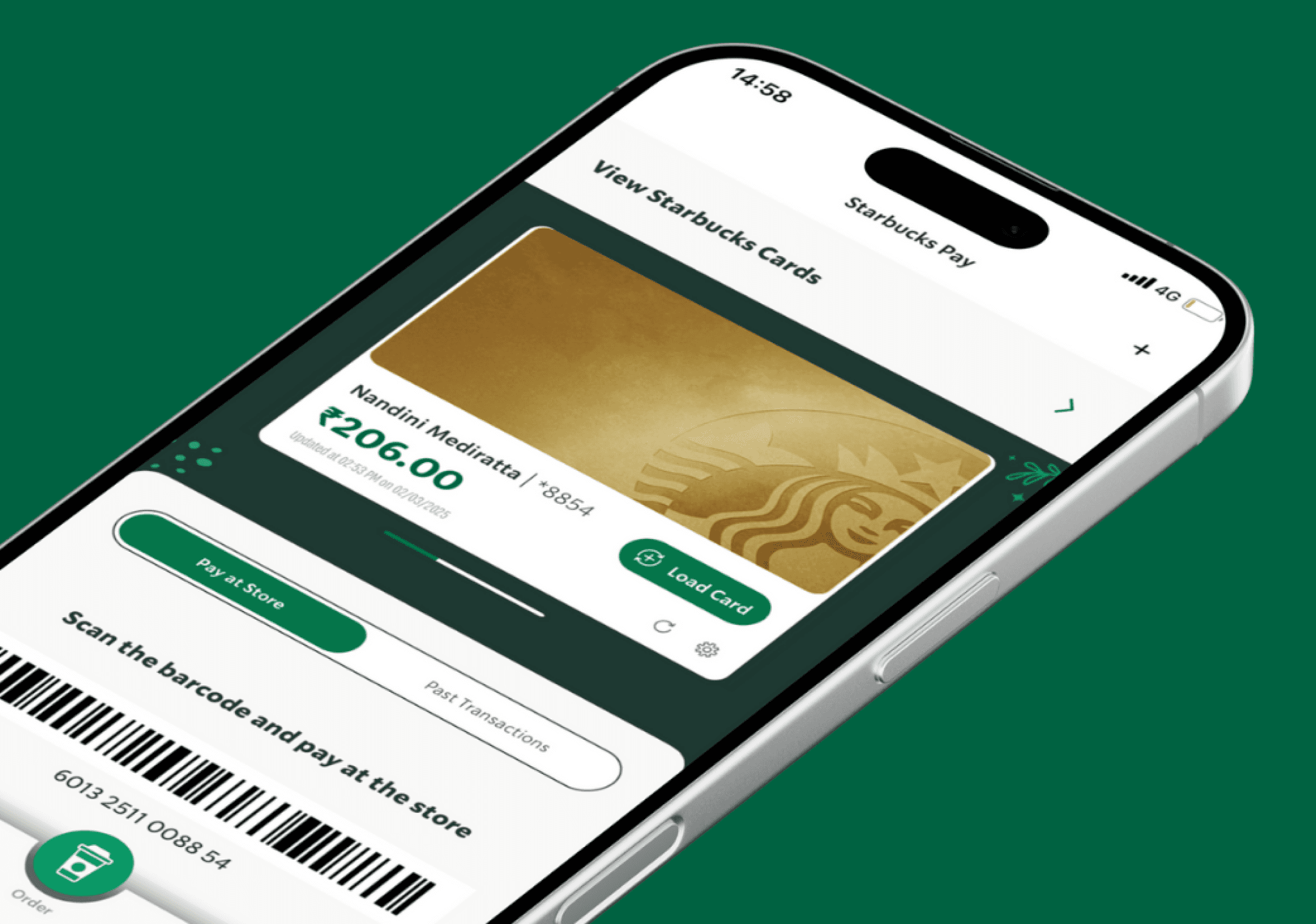
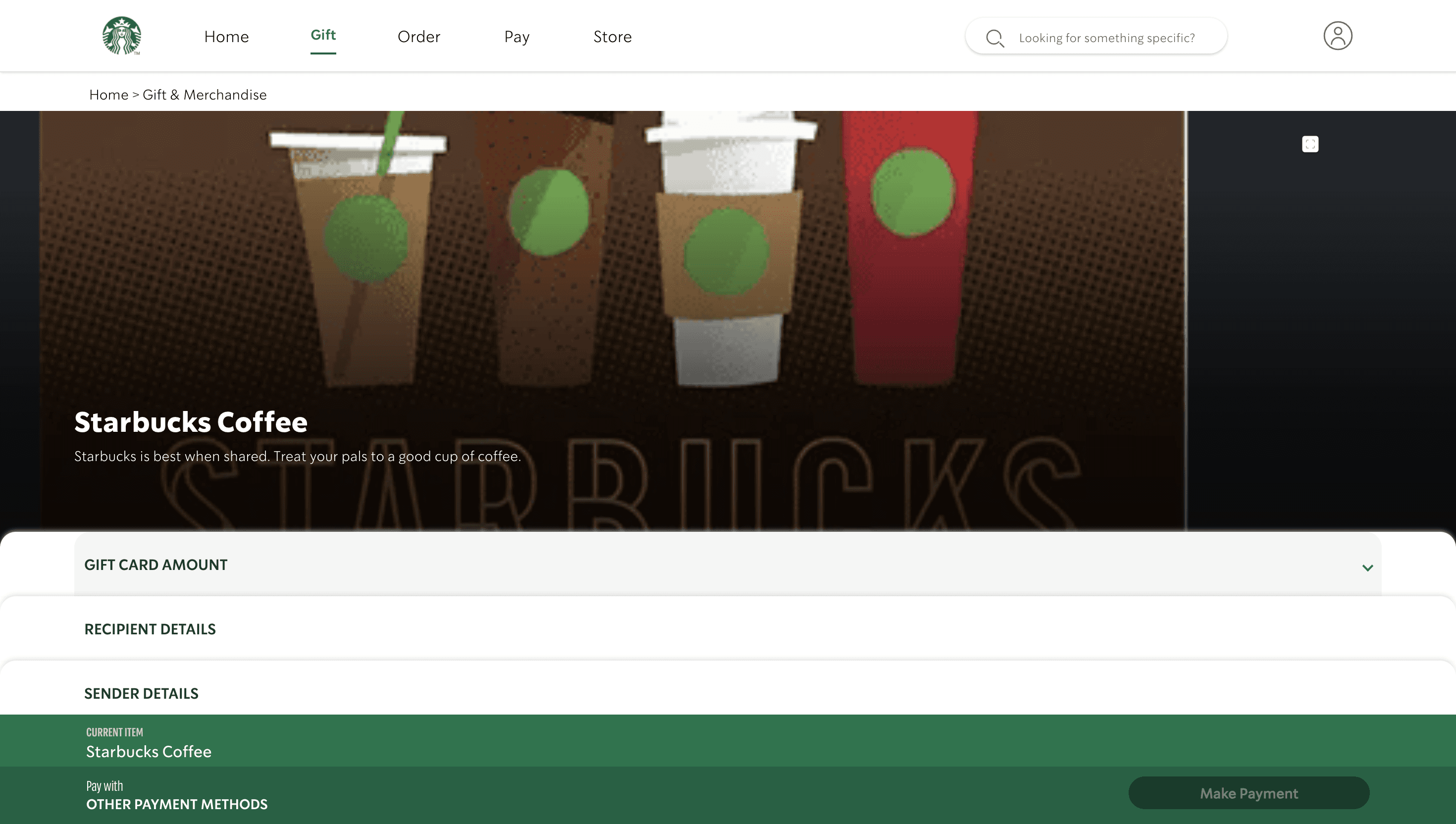
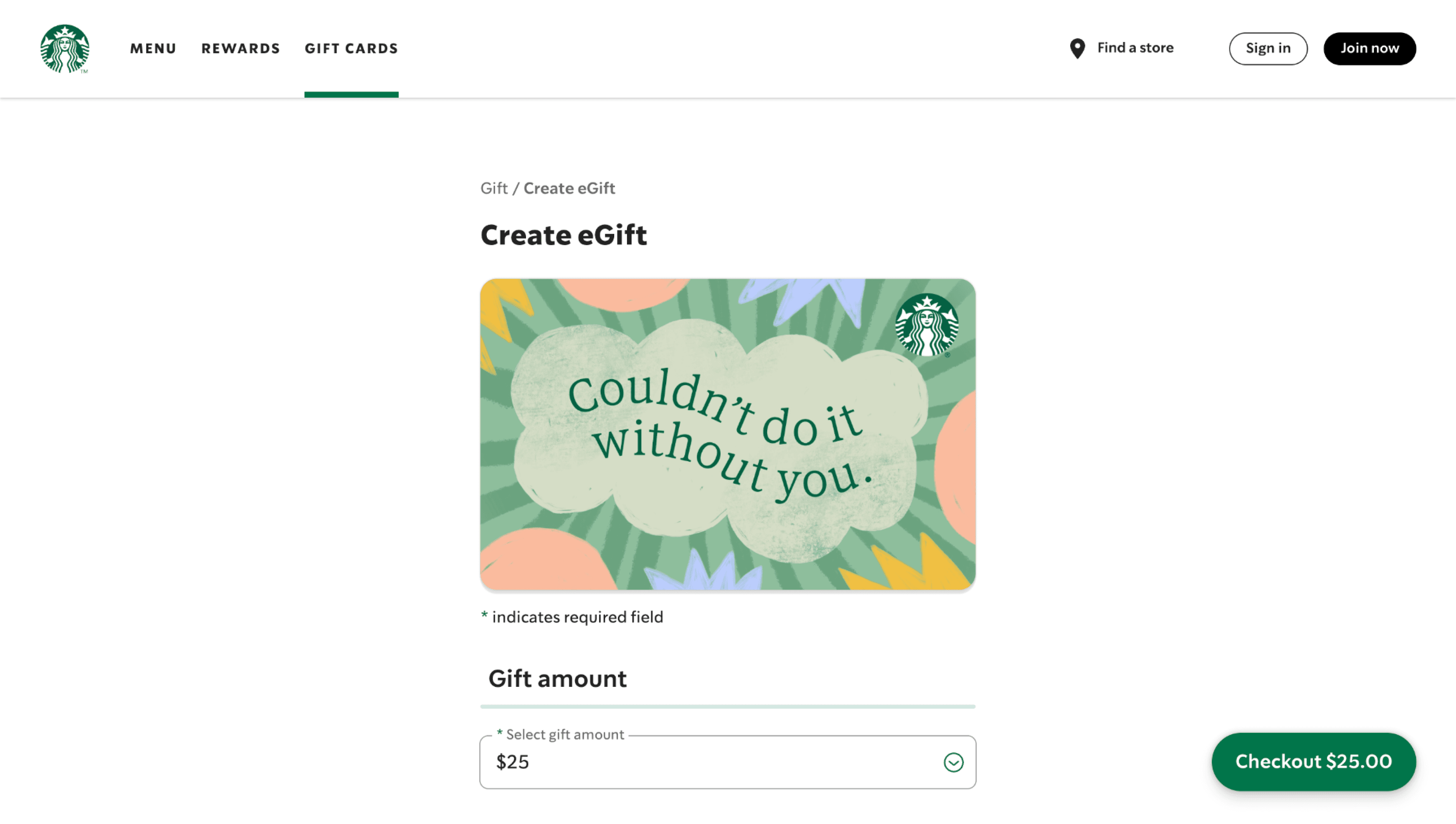
Starbucks Card
The Starbucks Card (physical or digital) can be used for payments and is linked to the rewards system. Customers can reload balances and manage multiple cards via the app.
Starbucks App
Starbucks offers the largest and most robust mobile ecosystem of any retailer in the world , with more than 12 million Starbucks Rewards™ members, eight million mobile paying customers.
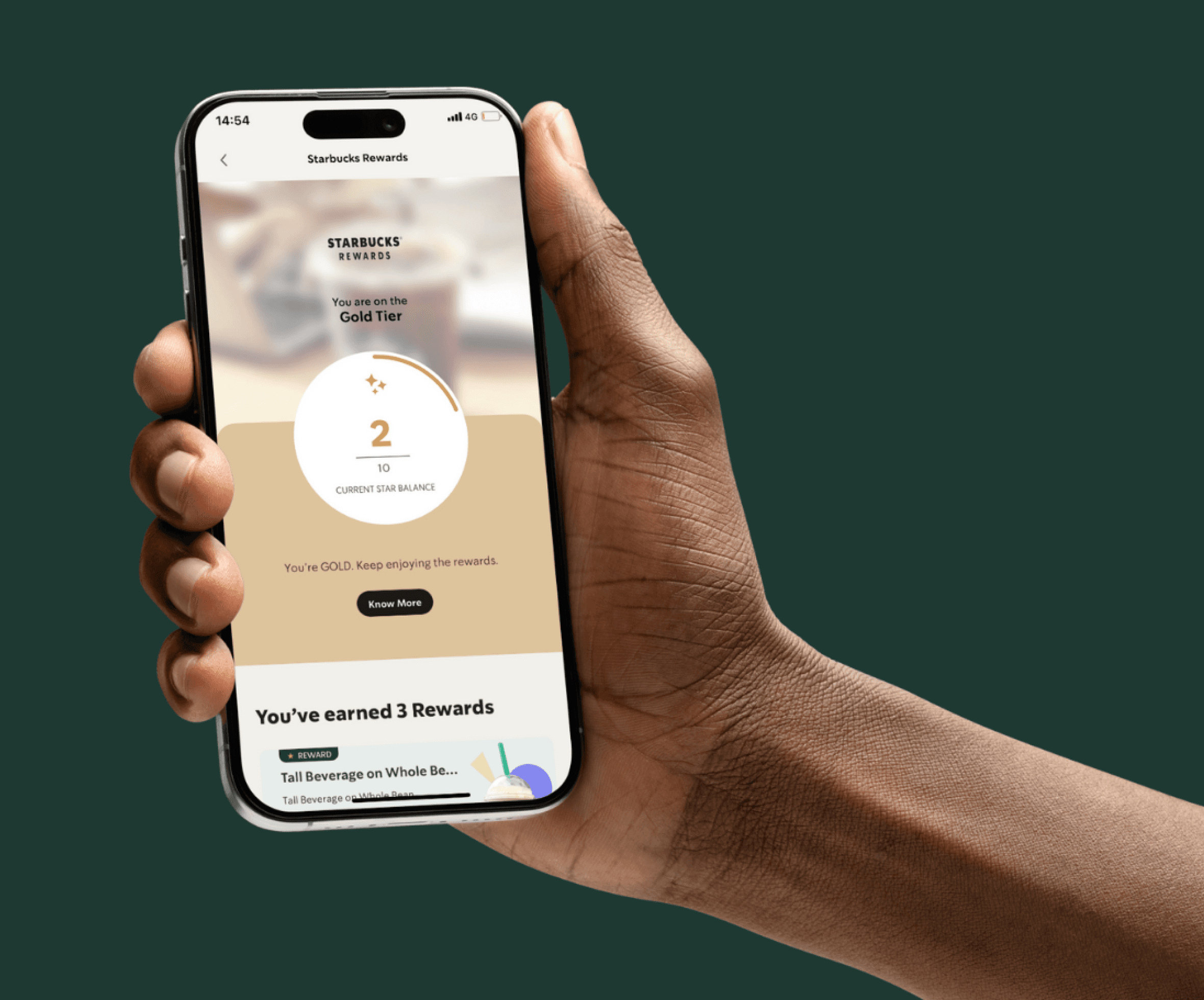
Starbucks Rewards
The “My Starbucks Rewards” program enables customers to earn Stars for every purchase, which can be redeemed for free drinks and other benefits.
DIGITAL ECOSYSTEM


1.5M+
Users of the Starbucks India Application

USER FLOW OF STARBUCKS WEBSITE

Visibility of System Status
The system should always keep users informed about its status through timely feedback
Error Prevention
Minimize the chances of user errors by providing clear instructions or confirmation dialogs
Match of System and Real World
Interfaces should use familiar language & conventions that align with users’ real-world experiences
Recognition Rather than Recall
Reduce users’ memory load by making options, actions, and information visible
Recognize, Diagnose, Recover from Errors
Provide clear error messages that explain the problem and suggest solutions
User Control and Freedom
Users should be able to undo or redo actions easily, providing them control over their interactions
Flexibility and Efficiency of Use
Interfaces should cater to novice and expert users by providing shortcuts or customizable options
Help and Documentation
Offer accessible help resources to assist users in understanding how to complete tasks effectively
Consistency and Standards
The design should maintain uniformity in visual language, and patterns to avoid confusion
Aesthetic and Minimalist Design
Avoid clutter by including only relevant elements, ensuring a clean and focused design
USABILITY HEURISTICS
1. Visibility of System Status
The system should always keep users informed about its status through timely feedback
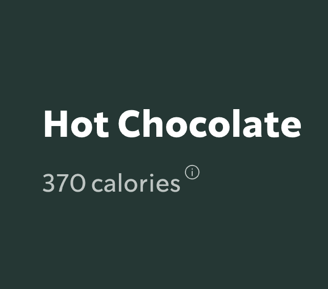
Food item availability based on location
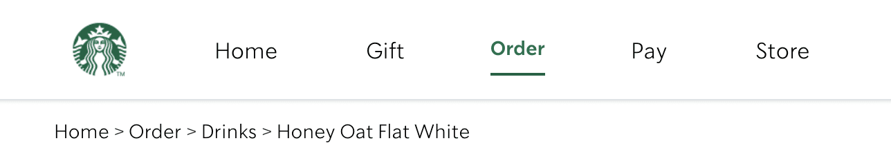
Breadcrumbs indicate where you are at in the website
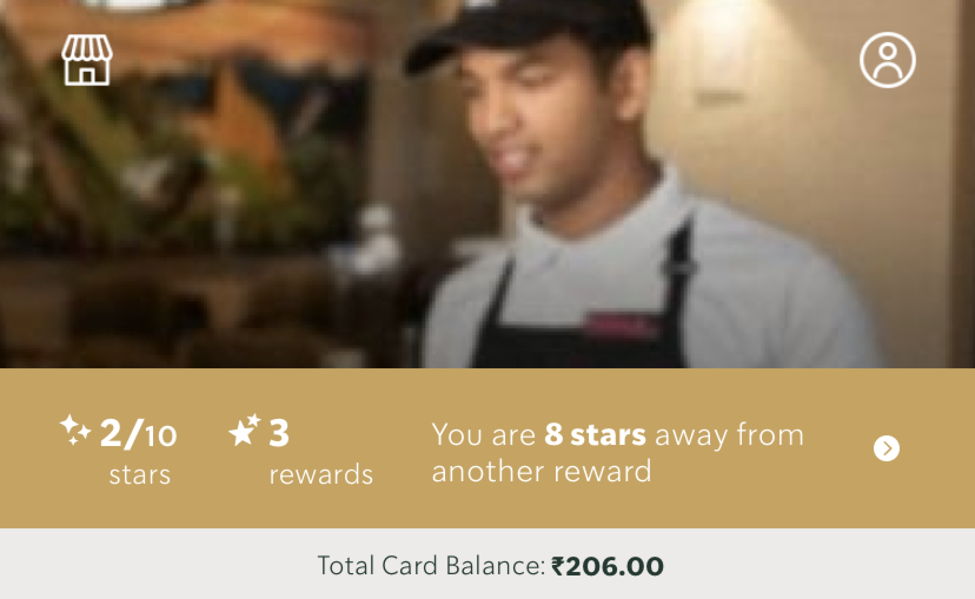
Immediate attention is given to the rewards and the stars that the customer has collected
Card balance visible in the hero section itself, however it’s not highlighted
2. Match between System and Real World
Interfaces should use familiar language & conventions that align with users’ real-world experiences
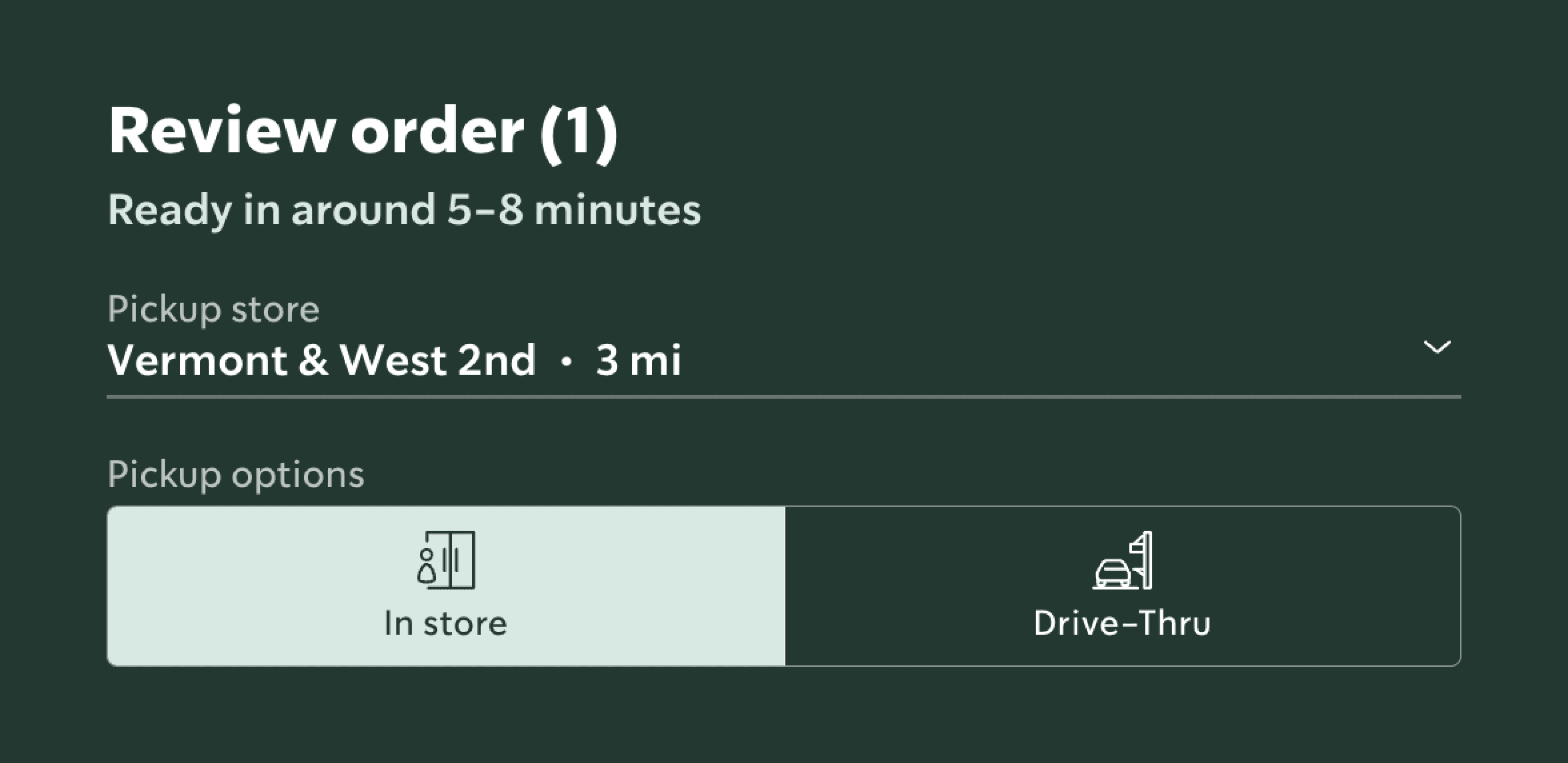
Finding store based on location and real-time estimation of preparation
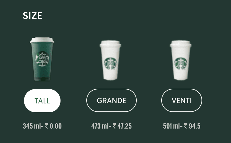
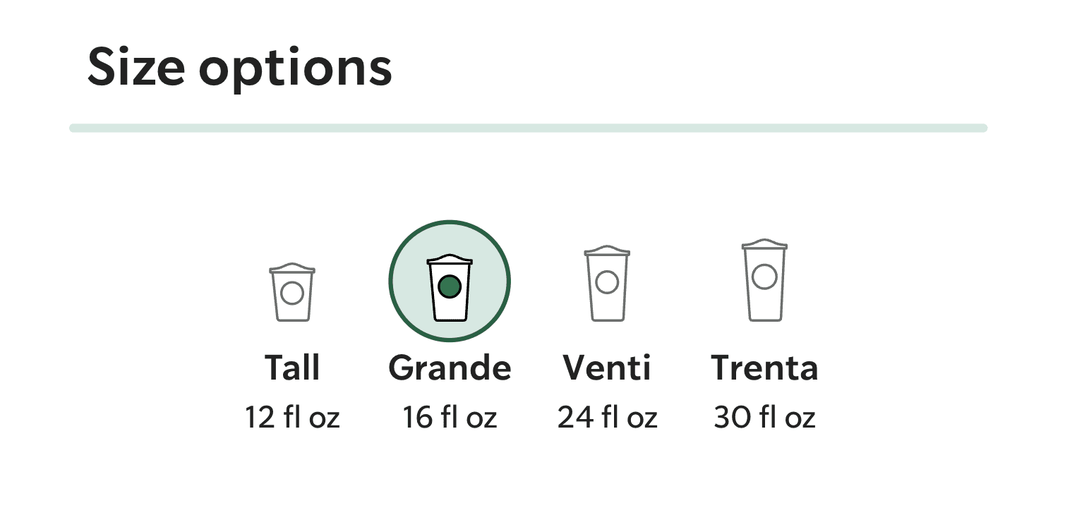
Cup sizes don’t match the real world on indian website
Indian Website
Global Website
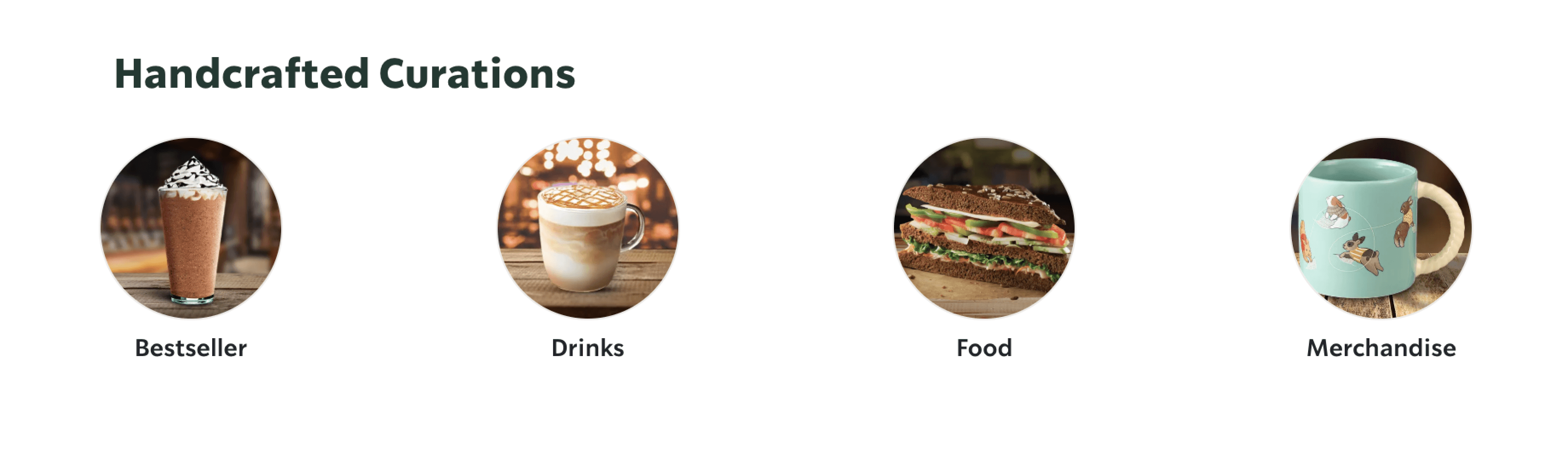
Part of the landing page but it’s unclear how and why are they curating this. It is not curated, it’s a categorisation of the menu, merch and other items they sell
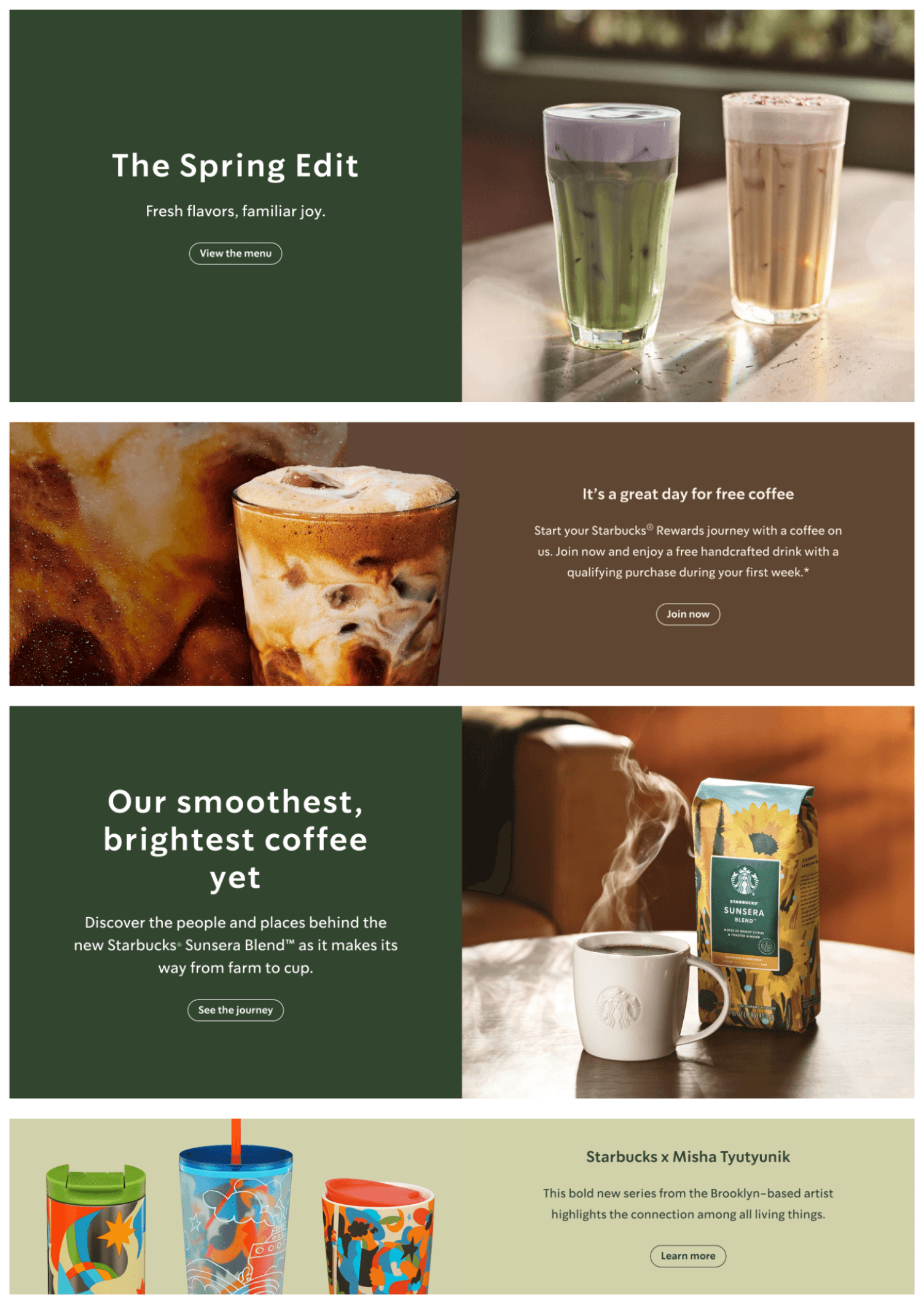
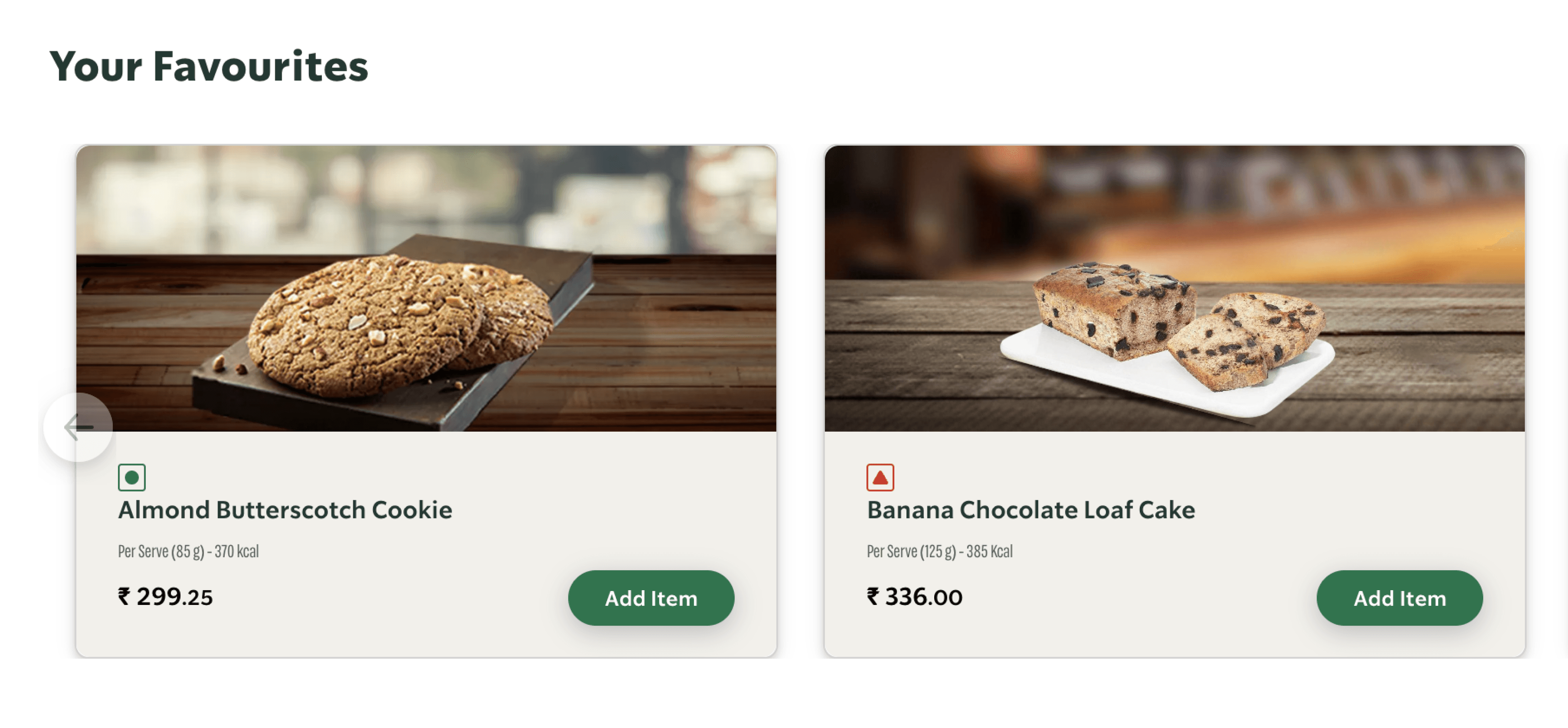
Good quality real photos of the drink

3. User Control and Freedom
The system should always keep users informed about its status through timely feedback
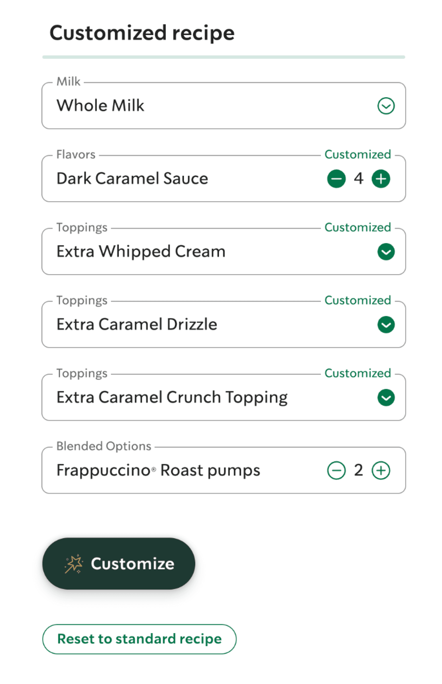
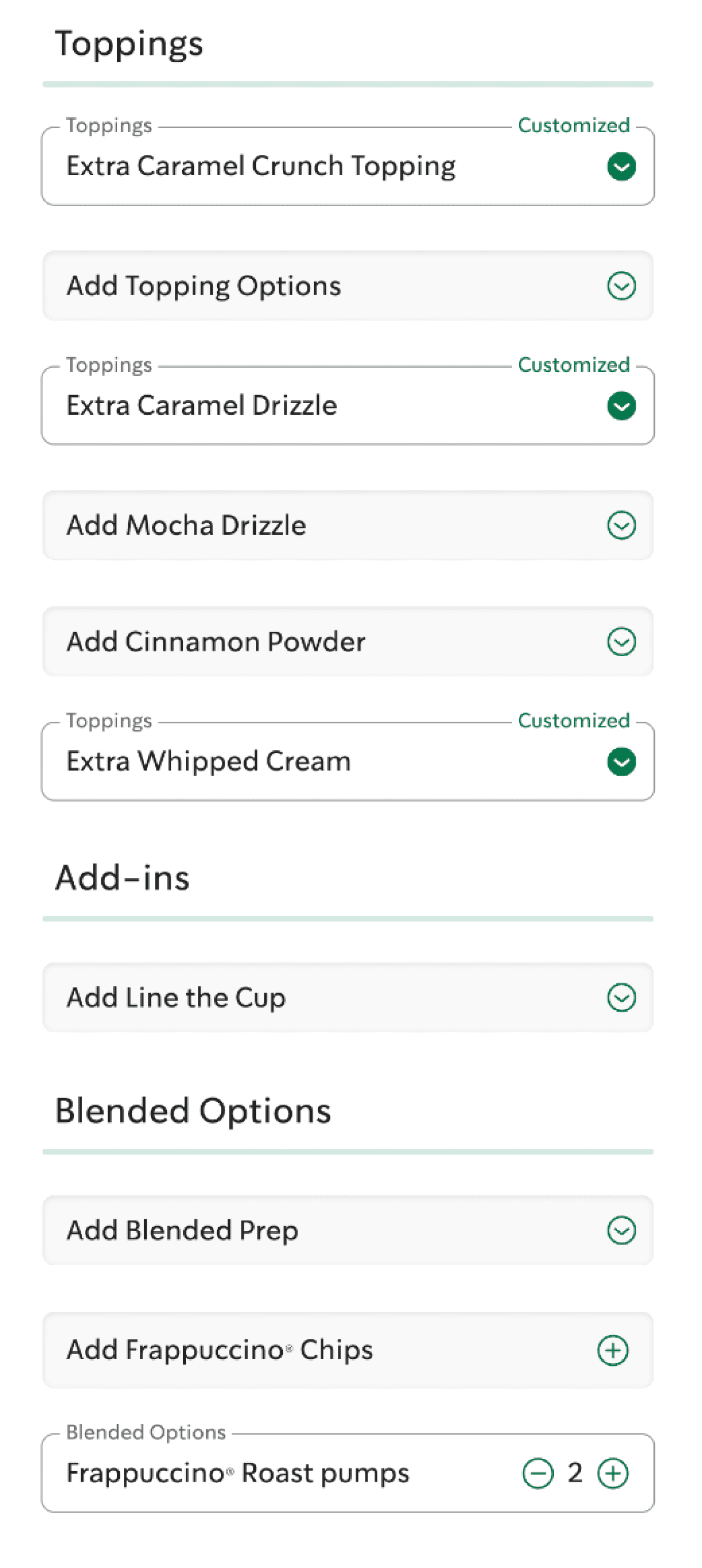
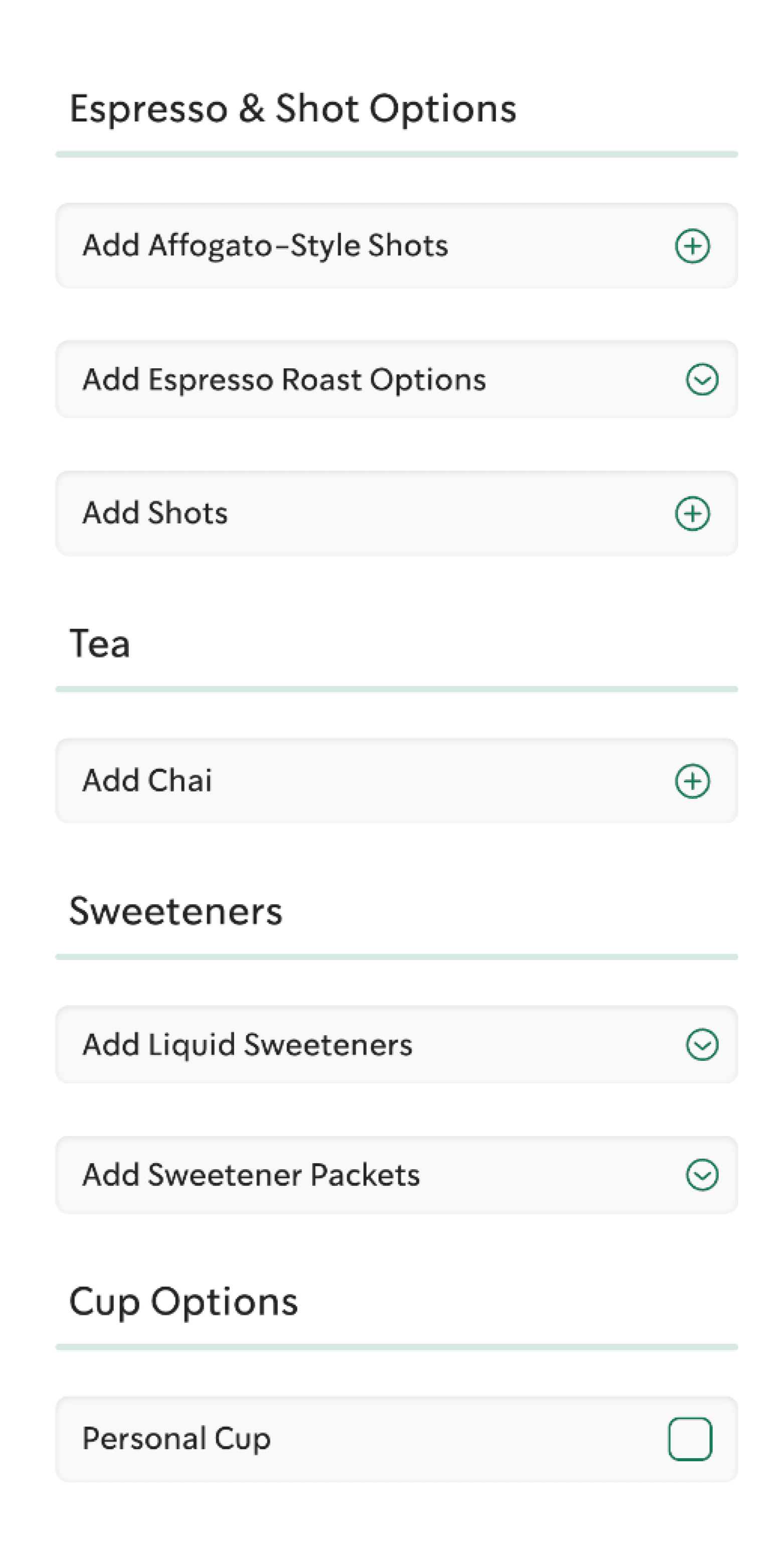
Easy and extensive customisation options for all beverages
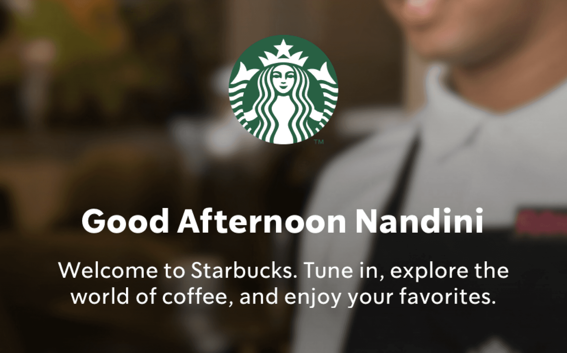
Personalised greeting with name and time of day
Choose your own card design
Advanced customisation options
4. Consistency and Standards
The design should maintain uniformity in visual language, and patterns to avoid confusion
Different navigation system for the global and Indian websites. Indian navigation is not very intuitive or explanatory whereas the navigation in the global website is clear and easy to understand
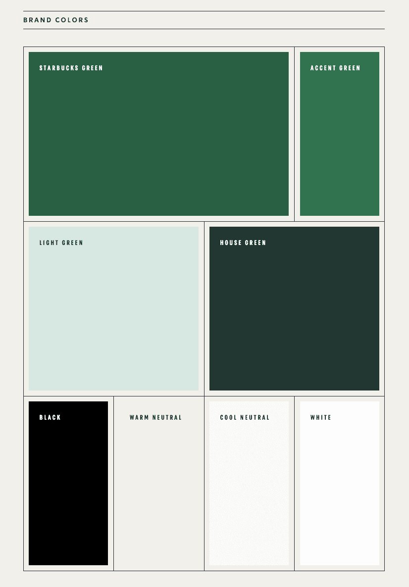
The colour system on the global website is different from the one mentioned in their brand book.


Indian Website
Global Website
5. Error Prevention
Minimize the chances of user errors by providing clear instructions or confirmation dialogs
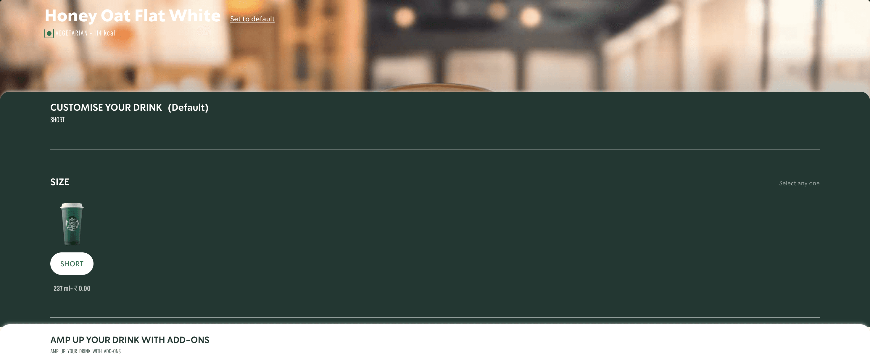
There is a scroll inside the “Customise Your Drink” with six to seven more options that gets missed out on due to the lack of visual cues
You cannot access Add-ons without the input in customisation even if it’s no customisation
6. Recognition rather than Recall
Reduce users’ memory load by making options, actions, and information visible
The card that you have chosen is not seen properly once you go on the details page in the Indian Starbucks website
Easy recognition of what you have selected in the global Starbucks website
Prompts you to re-order your favourited items based on your order history
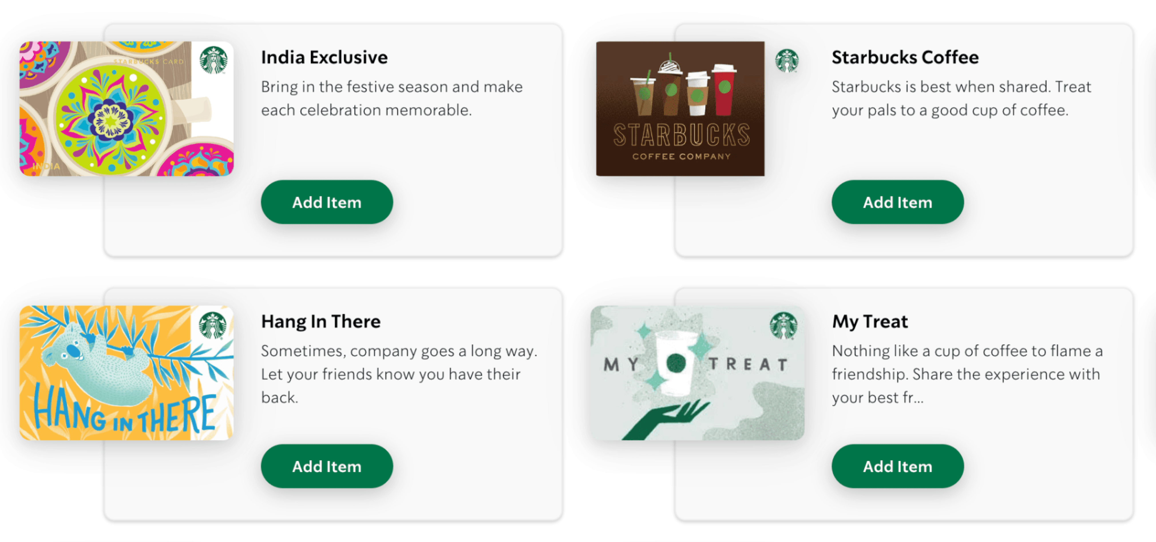
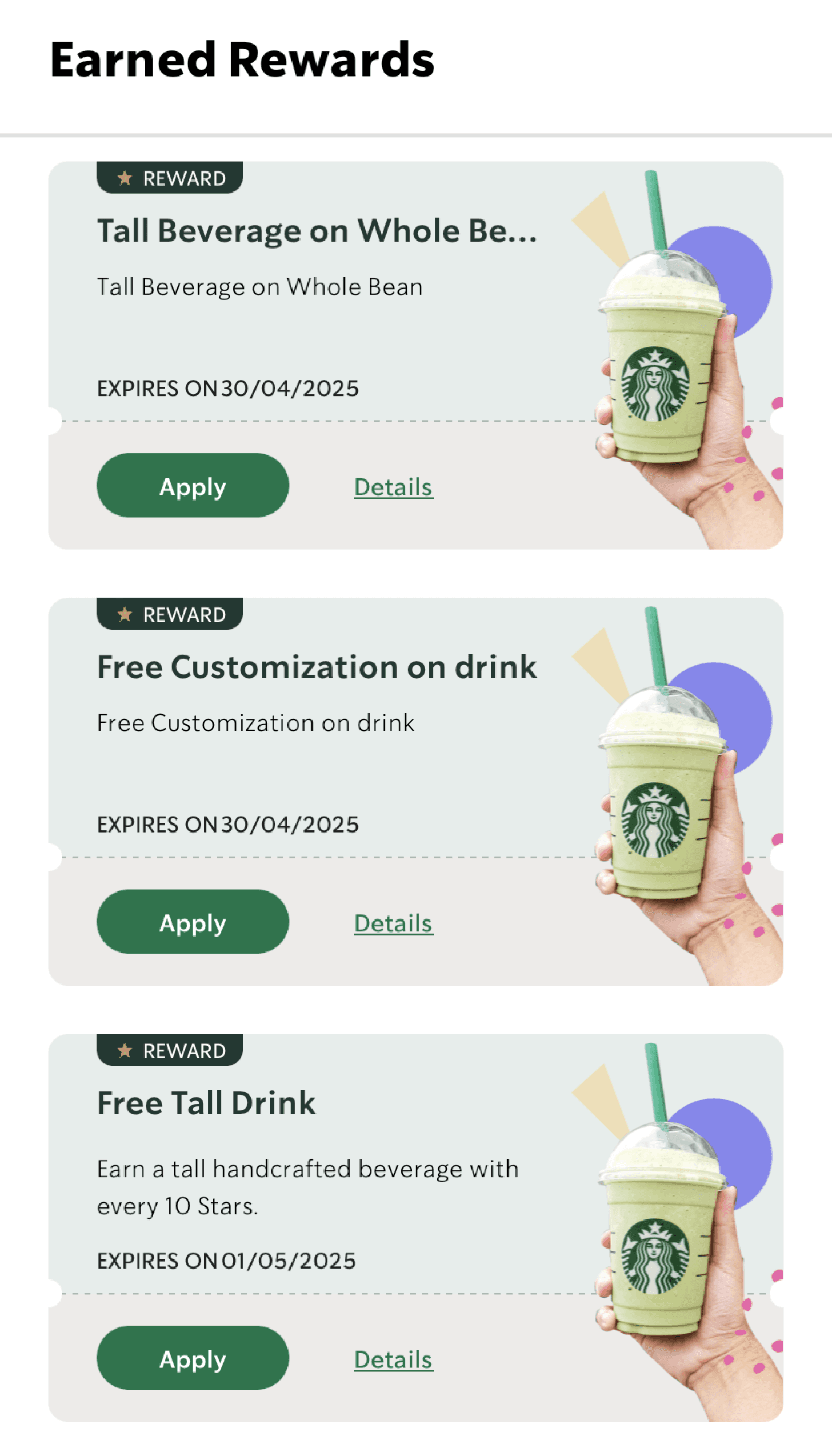
All the photos for different rewards are the same which makes it difficult to recognise and apply
7. Flexibility and Efficiency of Use
Interfaces should cater to novice and expert users by providing shortcuts or customizable options
Breadcrumbs make it easy to navigate inside pages, however lack of a back button makes things difficult
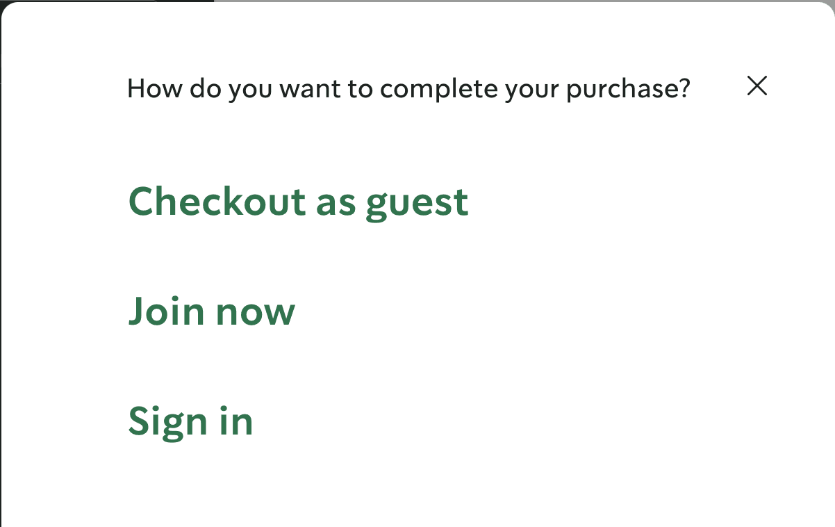
“Check out as guest” option makes the ordering easier. You are not forced into signing up or giving your personal details
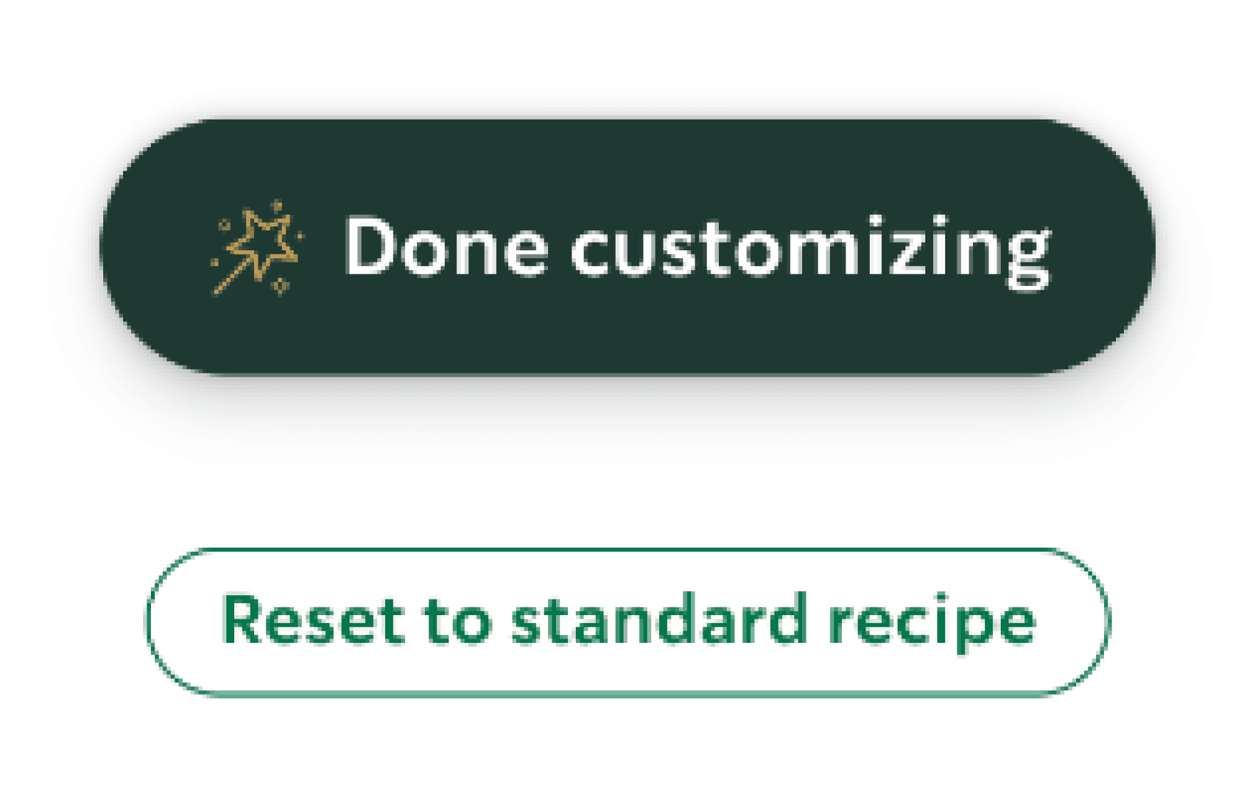
Easy call-to-actions. Easy to revert to default stage and easy to move forward.
Bringing your personal cups gives you a discount, which goes along with the sustainability practices of Starbucks
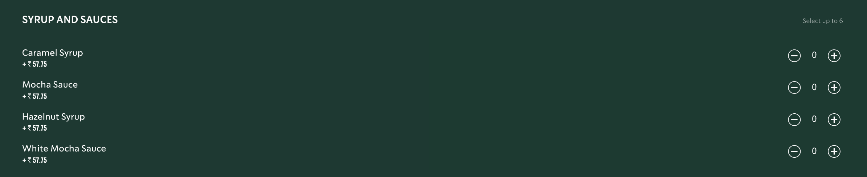
Very extensive list of customisations, every imaginable customisation for a beverage there is.
8. Aesthetic and Minimalistic Design
Avoid clutter by including only relevant elements, ensuring a clean and focused design


“Read more” in coffee details is not very user friendly for reading. Long sentences and no hierarchy in the info.
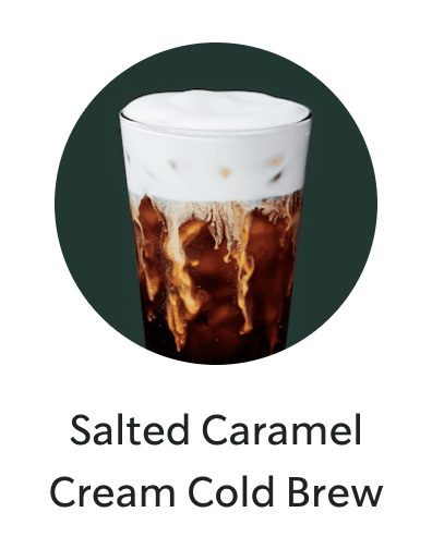
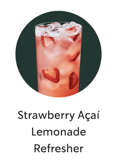
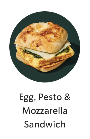
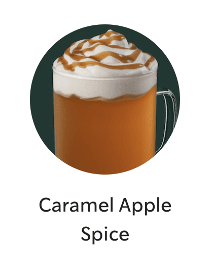
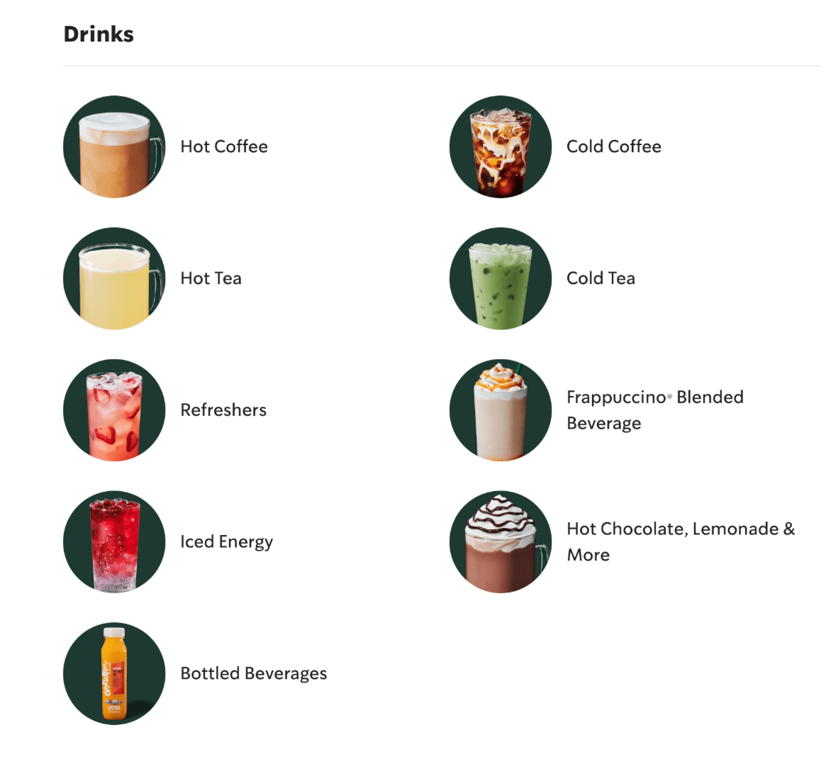
Easy to browse menu with proper imagery. It makes it easier to make decision based on your mood
Easy layout of the homepage for browsing. You can understand what Starbucks is up to within a few seconds of scrolling
9. Recognize, Diagnose, Recover from Errors
Provide clear error messages that explain the problem and suggest solutions

Asking users to double check their order and other details because they cannot cancel it later.
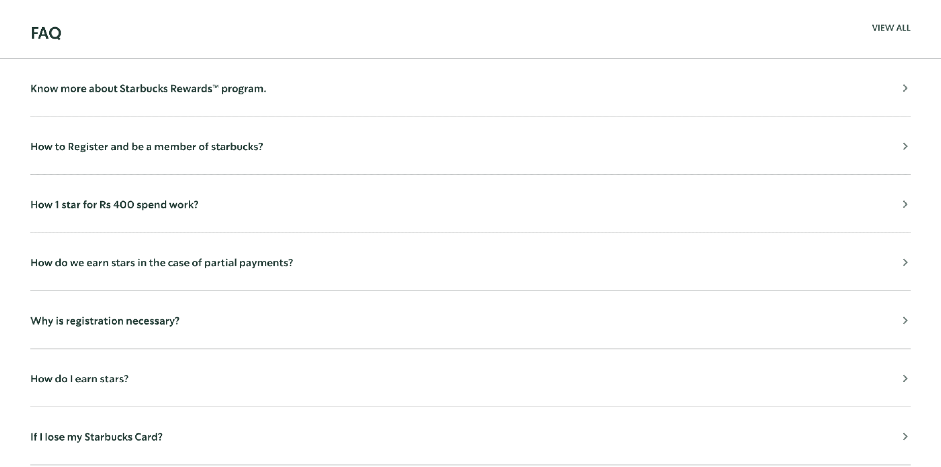
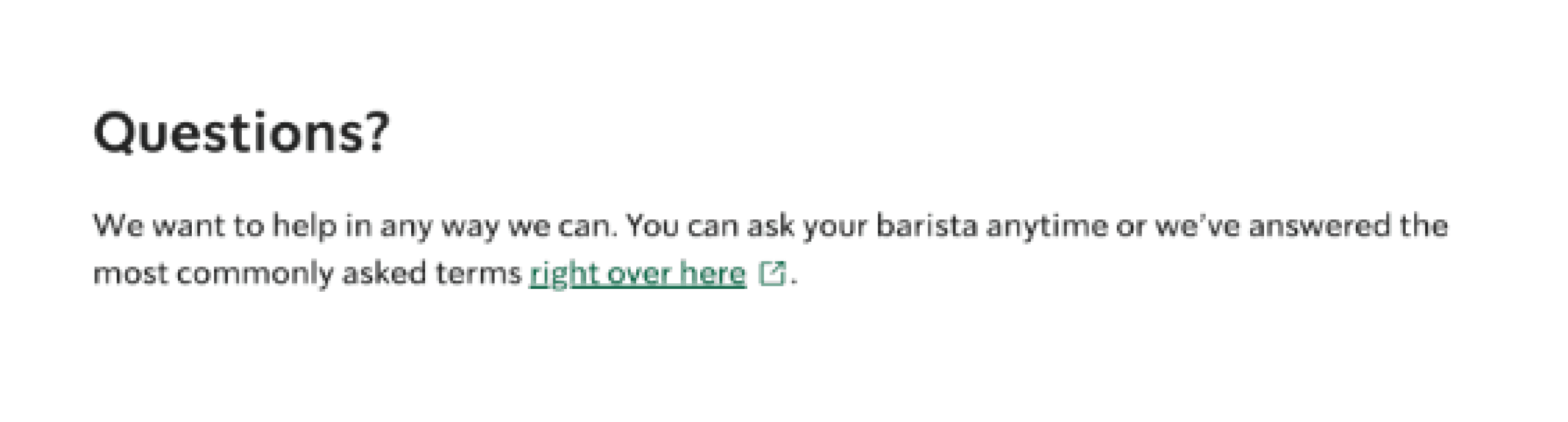
There is an exhaustive list of FAQs (over 40 questions) for the reward program on the website.
10. Help and Documentation
Offer accessible help resources to assist users in understanding how to complete tasks effectively


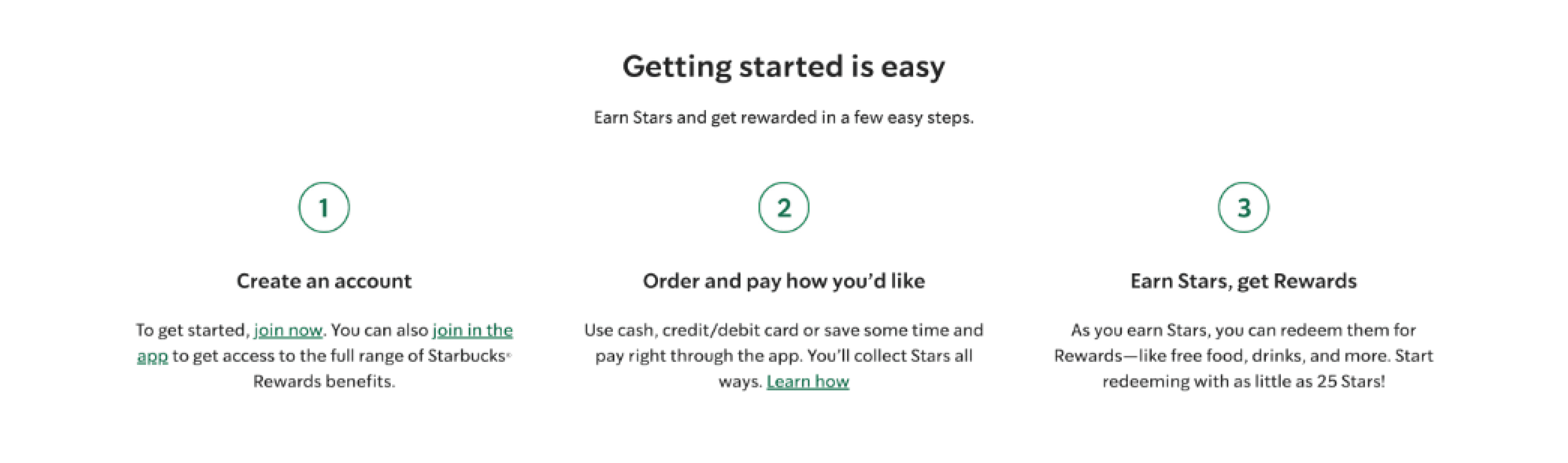
Easy to understand onboarding for the loyalty program
Designated help section in case of queries and doubts
Tool tips and fun facts on some of the pages that have extensive forms
All Rights Reserved
2025
mediratta.nandini@gmail.com